Know how people will see your design, before they see it.

EyeQuant predicts where attention goes, what gets missed, and what needs fixing, in under 5 seconds, before you spend a dollar on traffic.

See the heatmaps, summary and recommendations for yourself

Design Performance Indicators (DPIs)

52
76

Guidance and suggestions

Explore:
Attention
Clarity
Excitingness
Perception
Hot Spots
Ford Bronco webpageAttention heatmapClarity heatmapExcitingness heatmapPerception heatmapHot Spots heatmap

The landing page effectively captures viewer attention, using a dynamic image of a vehicle in action against a scenic backdrop, which aligns well with its intent to increase awareness and encourage purchases.

Clarity Analysis

The clarity map indicates that most textual elements, especially the "View Offers" button and pricing information, are in green regions, suggesting they are clear and easy to read. The clarity score of 68 supports this, reflecting a generally clean design. However, the central image area, particularly around the vehicle, shows some red areas indicating lower clarity, likely due to the complex visual nature of the photograph.

Attention Patterns

The attention map reveals significant focus around the vehicle itself, particularly on the headlights and frontal area, as these are in the warmer regions of the map. This suggests the visual design successfully draws attention to the product, which is crucial for an automotive landing page aimed at increasing interest and purchases.

Visual Excitement

The excitingness score of 80 shows the page is visually stimulating, largely due to the vibrant colors of the sunset and dynamic vehicle image. The excitingness map highlights these elements with red, signifying they are captured effectively in making an impression. This stimulation aligns with the goal to build excitement about the 2024 Bronco SUV.

Perception Insights

According to the perception map, the vehicle and key textual details are perceptible within the first few seconds. The transparency focused around the vehicle implies that this area will not be missed by viewers initially landing on the page, ensuring the product remains the focal point immediately.

Hotspot Analysis

The hotspots map underlines that the vehicle, particularly its frontal area, is the primary focal point with the largest circles, indicating the area of highest visual interest. This visual hierarchy ensures that the eye is guided to the most critical part of the design—the product being marketed.

Correlations

There is a strong correlation between attention patterns and excitingness; the vibrant colors and dynamic vehicle image not only attract attention but also contribute to the excitingness score. Clarity and perception work together to ensure that while the page is stimulating, critical information such as product details and call-to-action buttons remain clear and easily accessible.

Overall, the landing page is strategically designed to maintain viewer focus on the vehicle while ensuring key information is clearly communicated, balancing excitement with clarity to fulfill its marketing objectives.

Based on the EyeQuant data, the landing page effectively uses vibrant imagery to attract user attention and excite viewers, aligning with its goal of increasing awareness and purchase interest. While the design is largely successful, there are specific areas that could be optimized to further enhance clarity and focus on crucial elements.

Enhance Clarity of Vehicle Image

Element: Central vehicle image

Evidence: Clarity map shows red areas around the vehicle, indicating lower clarity.

Recommendation: Simplify the background around the vehicle by subtly reducing the intensity of the surrounding dirt cloud. This will help reduce visual clutter and improve focus on the vehicle outline, making it clearer against the scenic backdrop.

Increase Contrast of Call-to-Action Button

Element: "View Offers" button

Evidence: The button, while in a clear area, competes with the vibrant background.

Recommendation: Change the button color to a bold red (#FF0000) to increase contrast against the background, ensuring it stands out more effectively. This will draw direct attention to the call-to-action, encouraging interactions.

Clarify Pricing Information

Element: Pricing section

Evidence: Clarity map indicates lower clarity here compared to other textual elements.

Recommendation: Increase the font size from approximately 14px to 16px and make it bold to ensure pricing details are quickly noticeable. Additionally, consider adding more whitespace around this block to distinguish it from other text areas.

Highlight Headline with More Vibrancy

Element: "2024 Bronco®" headline

Evidence: Although clear, the headline could use additional emphasis to match the exciting visual theme.

Recommendation: Add a subtle text shadow effect to the headline to create depth, making it pop against the dynamic background. This will ensure immediate recognition and reinforce brand awareness.

Improve Navigation Visibility

Element: Top navigation text

Evidence: Perception map shows reduced visibility in the navigation area.

Recommendation: Increase the contrast of the navigation text to a lighter shade (e.g., white #FFFFFF) to ensure it remains perceptible against varying background tones. This change will support usability by making key navigation options more accessible.

By implementing these specific changes, the landing page can better balance visual excitement with essential clarity, effectively guiding users to key actions and enhancing overall engagement.

Trusted by teams at

Ford
AstraZeneca
Canon
Legal & General
Groupon
Liberty London
Dentsu
VML
Tinuiti
Jellyfish
Ford
AstraZeneca
Canon
Legal & General
Groupon
Liberty London
Dentsu
VML
Tinuiti
Jellyfish

The status quo

The problem with testing after you launch

Most teams build a page, send traffic to it, and then wait to find out what's wrong. By the time the data is clear, the budget is spent, the dev cycles are burned, and the redesign is already overdue.

CRO is supposed to fix this. But CRO requires traffic, time, and organizational patience, three things most teams don't have.

What if you could test before launch without any traffic at all?

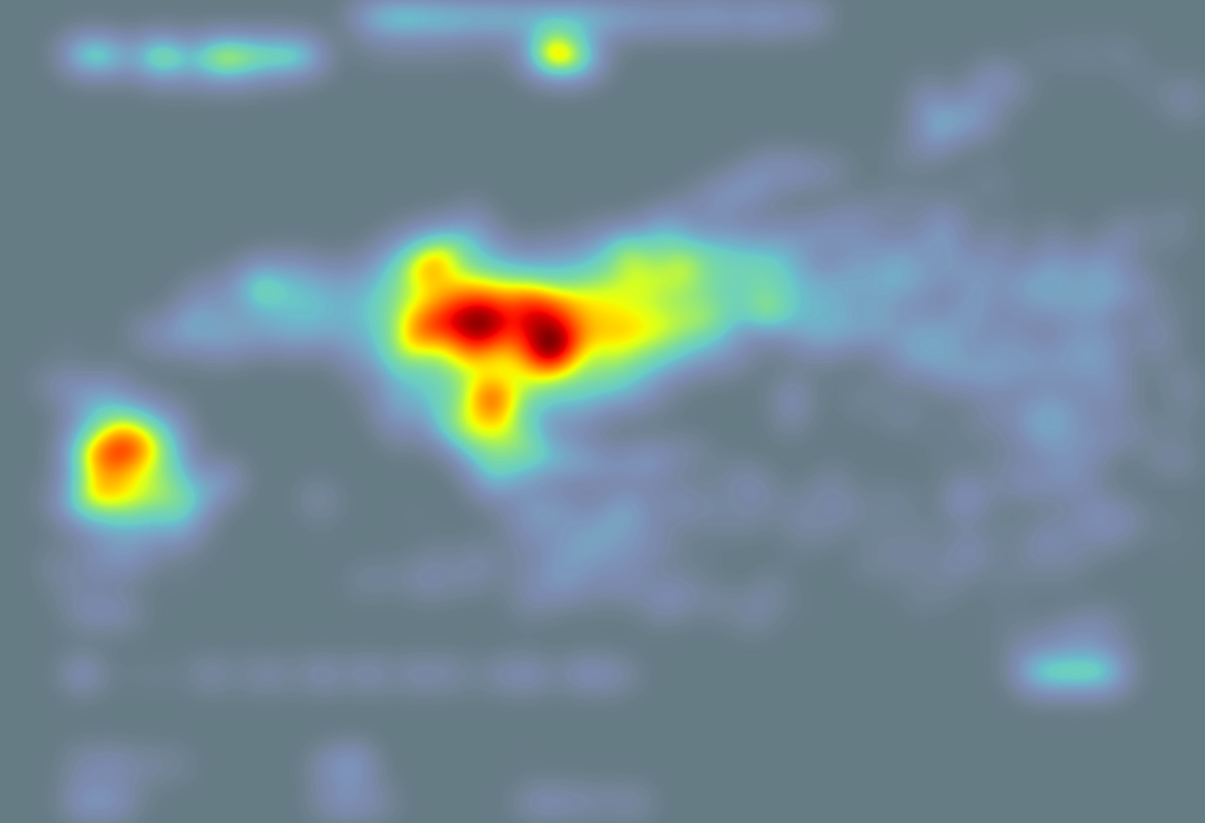
EyeQuant uses AI models trained on real eye-tracking research to predict how people will visually process your design. Where they'll look first. What they'll miss. Where they'll hesitate. You get these insights before launch, so the first version you ship is already strong.

This isn't optimization. It's confidence.

HOW IT WORKS

Three steps. Five seconds. No traffic required.

01

Upload your creative

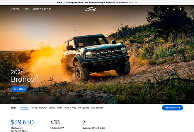
Drop in a screenshot, URL, or Figma design. Landing pages, ads, emails, packaging, anything visual.

02

Get instant analysis

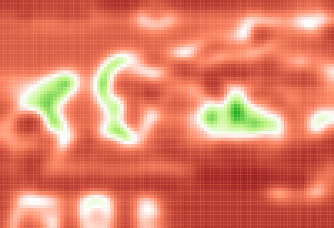
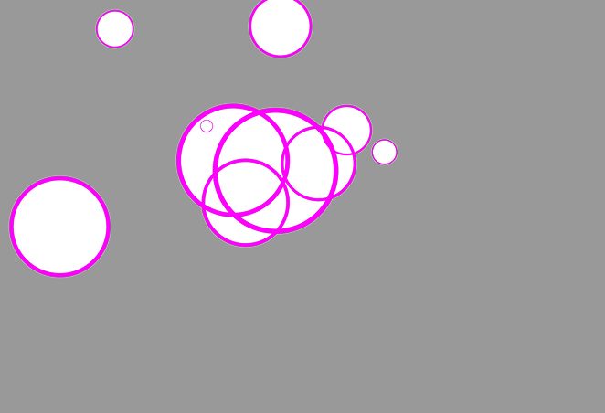
In under 5 seconds, EyeQuant maps where attention will go, scores your design for clarity and engagement, and surfaces specific recommendations for improvement.

03

Ship with confidence

Iterate on the feedback, re-test in seconds, and launch knowing your design will perform.

PRODUCT

See it in action

app.eyequant.com/analysis
EyeQuant Analysis

Upload any design. Get a full attention analysis, clarity and engagement scores, and plain-language recommendations to improve, all in seconds.

USE CASES

One platform. Every visual.

Landing Pages & Websites

Stop burning media spend on pages that don't convert. Predict what visitors will see, and miss, before you send a single click.

Ads & Performance Creative

Validate creative before it goes live. Know whether your CTA pops, your message lands, and your visuals guide the eye where they should.

Emails & Digital Assets

Analyze full-length emails, banners, packaging, and PDFs without splitting them into screenshots. One upload, one report.

Video & Motion Content

Analyze dynamic content, animations, and video ads. See how motion guides attention and where viewers lose focus, frame by frame.

RESULTS

The numbers speak

£0M

Liberty London redesigned their homepage based on EyeQuant insights. The result: 26% more search usage, 15% higher revenue per user, and £6M in additional revenue over 12 months.

Liberty London

0%

GreatPixel used EyeQuant to optimize Enel's digital experience. Conversion rates jumped 31%, click-through rose 14%, and the design process shortened by 25%.

GreatPixel / Enel

0%

Groupon pre-tested landing page iterations with EyeQuant, identifying attention gaps before launch. Sign-ups increased by 52%.

Groupon

It's like spell check, but for designs.

Fabien Caublot

Conversion Specialist, Canon

We use EyeQuant with all our CRO clients. They love how quickly we can produce assessments of pages they're in the process of designing.

Kendall Giglio

Director of Conversion Rate Optimization, Tinuiti

INTEGRATIONS

Works where you work

EyeQuant fits into your existing design process, not alongside it.

Figma Plugin

Figma Plugin

Analyze designs without leaving Figma. Iterate in real time.

Adobe Photoshop

Adobe Photoshop

Run analysis inside Photoshop with overlay results on your artboard.

Chrome Extension

Chrome Extension

Audit any live page in one click.

API

API

Build EyeQuant into your own tools, dashboards, or creative ops workflows.

MCP Server

MCP Server

Use EyeQuant from ChatGPT, Claude, or any AI agent workflow.

See what your users will see.

Start with a free trial, no credit card, no tracking code, no setup. Upload your first design and get results in seconds.