
Most of the advice about attention prediction focuses on landing pages. One screen, one CTA, one conversion goal. That's a real and useful application but it's not the only one, and it's not the harder one.
I work on the product itself, and product UI is a different problem. Users arrive with intent, not curiosity. Screens have to support more than one thing at once, and "winning the first three seconds" matters less than making sure the right thing is reachable on every screen, every time.
This is the framework we developed running attention analysis across our own redesign last autumn, and the one we'd recommend to any product team trying to do the same.
The framework we built (and why we needed one)
Early on, we realised we didn't have a consistent way of using the tool on our own screens. We'd run an analysis, look at the heatmap, react to it, tweak something, run it again. That loop isn't useless, but it's not rigorous either.
So we built a six-step framework (and the order matters).
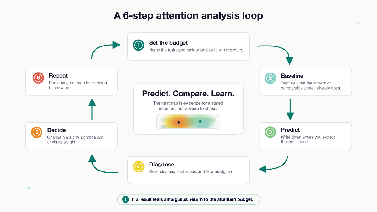
1. Define the attention budget before you open the design tool
Write down what each screen is actually for. What are the primary tasks a user might be here to do? Are they ranked, or are they peers? What needs to be available but shouldn't compete?
This sounds obvious. In practice, most teams, us included, before we got disciplined about it, design a screen and then justify the hierarchy afterwards. Flipping that order changes everything. You commit to an attention budget first, and the design gets evaluated against it.
For single-task screens, the budget is simple: one focal point, everything else subordinate. For multi-task screens, which are the harder and more interesting ones, attention should distribute across the primary tasks in proportion to their importance, without any one zone swallowing the others.
Without this step, you're just looking at heatmaps and reacting.
2. Baseline before you change anything
Run the existing design through EyeQuant before you touch it. Every time.
Two reasons. First, you'll find out what the current design is doing right, which you need to know so you don't accidentally remove it. Second, it becomes your reference point for every iteration that follows. "Better than the last version" is a much stronger claim when you have the versions on file.
If you're working on a screen that doesn't exist yet, baseline a comparable screen from your product or a competitor's. The point is to start with a reference, not from zero.
3. Predict before you analyse
Before running each analysis, write down what you expect to see. Where will the eye land first? Which elements will draw attention? Which will be ignored?
This is the single highest-leverage habit in the whole process, and the easiest one to skip. If you don't do it, you'll rationalise whatever the heatmap shows. If you do, you'll catch your own assumptions, which is where the real learning is.
4. Read the heatmap as a diagnostic, not a scoreboard
The most common mistake is treating the heatmap like a leaderboard, most red wins. It's not that, it’'s a diagnostic. Specifically, look for:
First-fixation zones. Where does the eye land in the initial seconds? Is that where the most important task lives, or somewhere adjacent?
Cluster shape and distribution. One strong cluster suggests a single point of focus. Two distinct clusters suggest two competing or complementary points of focus, which is what you want on a multi-primary-task screen, and what you don't want on a single-task one.
The cool zones. What is the model predicting people will ignore? If anything important is in a cool zone, you have a decision to make: redesign, or accept the demotion.
The flow between focal points. When attention does spread across the screen, does it move between elements that are meant to work together? Or does it bounce around in ways that suggest competition rather than hierarchy?
5. Iterate the decision, not the pixels
When a heatmap surfaces something worth changing, resist the urge to nudge spacing and re-run. That's chasing the heatmap. It produces designs that score well and feel hollow.
Instead, identify the actual design decision the heatmap is pointing at, composition, hierarchy, visual weight, the positioning of a primary action, the removal of decoration that's competing for nothing in return. Change that. Then re-analyse.The point of the next analysis isn't to confirm the change worked; it's to check whether your new prediction matches the new result.
6. Run it often enough that patterns become visible
A single heatmap on a finished design is informative but not that useful. The same screen analysed across the design process is a different thing entirely.
For our redesign we settled on three to five rounds per significant screen: baseline, first proposal, one or two targeted iterations, and a final check before shipping. The exact number mattered less than the discipline of doing it consistently.
Case study: our own redesign
We used this framework on every meaningful screen in the redesign. Looking back, a few lessons stood out.
The baseline saved us from removing things that were already working.
On more than one screen, the baseline analysis showed the existing design was doing something quietly right that the proposed new direction was about to flatten. That's the failure mode redesigns are most prone to: fixing what isn't broken because you didn't check first. The discipline of always running a baseline saved us from at least a handful of those mistakes.
Predicting before analyzing surfaced our blind spots. The most consistently useful habit was writing down what we expected before each run. Our predictions and the model's results agreed maybe 60% of the time. The other 40% was the part that mattered, every gap was either a design decision worth revisiting or an assumption about user attention worth correcting.
The hardest screens were the multi-primary-task ones. Our application has views where the user might reasonably be doing one of several things, reviewing a recent analysis, starting a new one, jumping into a different project. On one of these, an early proposal had a strong, confident primary action that the heatmap loved. The problem was that it loved it too much: a second, equally important entry point was effectively invisible in the prediction. We weren't going to demote either task, so we changed the decision rather than the pixels, rebalanced the visual weight, adjusted spacing, removed surrounding noise that was competing with the secondary zone for nothing in return.
The next analysis showed two distinct clusters instead of one dominant one. That was the goal we'd written down at the start. The screen shipped that way.
The iteration count varied more than I expected. Some screens settled in two rounds. Others took five or six. The screens that took longest weren't the visually complex ones, they were the ones where we hadn't been clear enough about the attention budget at the start. When the framework's first step is wishy-washy, every subsequent step pays for it.
What I'd take away from this
If you're using EyeQuant, or any attention prediction tool, on product UI, these are the habits that made the biggest difference for us:
- Define the attention budget per screen before you design. Especially for screens with more than one primary task. This is the decision that makes everything else useful.
- Baseline first. Always. You need to know what you're working with before you start changing it.
- Predict before you analyse. The gap between your prediction and the result is the actual signal. Don't skip this.
- Iterate the decision, not the pixels. If the heatmap surfaces a problem, fix the underlying design choice, not the surface.
- Run it often enough that patterns emerge. Once is informative. Four times is diagnostic.
None of this is EyeQuant-specific, the framework is portable. But if you're analysing a real product interface, especially one where users have more than one job to do, this is the approach that worked for us. And the screens that gave us the most trouble were always the ones where we'd skipped step one.