
The Challenge
On the Epson website, customers can buy printers, ink, paper, projectors, and other products. Epson's eCommerce team is continuously running A/B and Multivariate tests, and were looking for an insights tool that could help them run smarter design tests. They turned to EyeQuant for help.
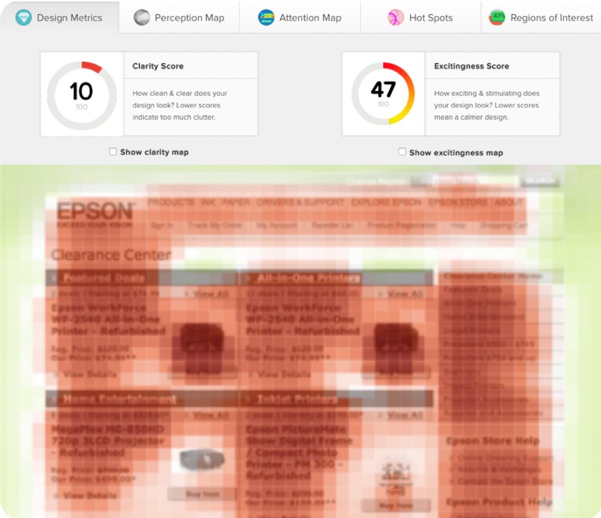
A quick EyeQuant test uncovered that the category page presented too much content upfront. Its clarity score was at 10/100, which can lead to higher cognitive load for users.
Epson decided to change this by de-cluttering their page and creating a clear visual hierarchy.
They tested a number of hypotheses such as:
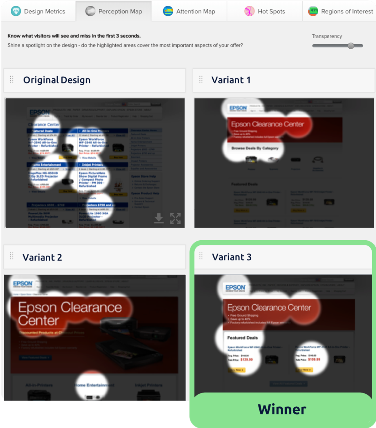
The final design
The team ultimately decided on a design that a) directed user attention to exactly the right content, and b) did so in a way that was visually clean, clear, and well organized – achieving a clarity score of 78.
This is well above average for category pages, and is a 68-point improvement on the existing version of the page. The new design was shipped for A/B testing.
The Results
- Over 20% more clicks through to the product pages or featured items.
- Over 20% more clicks through to category pages.
- Over 10% more clicks on the “buy now” buttons.
Ready to see results like these?